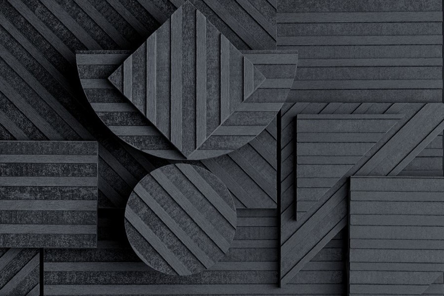
In recent years, there has been a growing trend towards using dark colors in commercial buildings. Traditionally, commercial buildings were designed with light, neutral colors to create a sense of cleanliness and professionalism. However, dark colors have become increasingly popular, as they can create a sense of sophistication, drama, and luxury. In this article, we will explore the trend of using dark colors in commercial buildings and why it has become so popular.
First, let's look at the benefits of using dark colors in commercial buildings. Dark colors can create a powerful and dramatic effect that can be visually stunning. They can add depth and dimension to a space, making it feel larger and more spacious. Additionally, dark colors can help to create a sense of intimacy and privacy, which can be important in commercial settings such as restaurants, bars, and hotels. Dark colors can also be used to create a sense of luxury and exclusivity, which can be appealing to high-end clients.
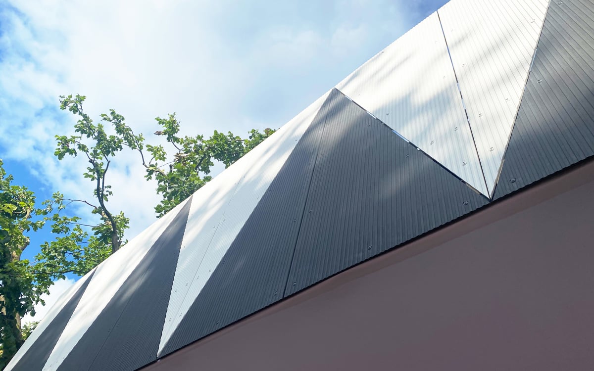
EQUITONE [linea] in LT85 on the Clerkenwell Pavilion by Fieldwork Architects.
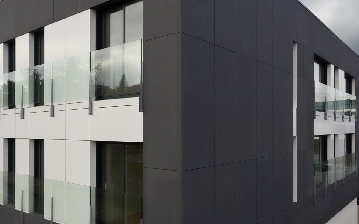
EQUITONE material TE85 on Vía Célere in Spain. Image by Wood Target; Architecture by Fernández - Abeijón Arquitectura
Another reason why dark colors have become so popular in commercial buildings is that they can help to create a memorable brand identity. Many companies are looking for ways to stand out in a crowded market, and using dark colors can help to create a unique aesthetic. This can be particularly important in industries such as fashion, hospitality, and entertainment, where companies need to create a strong visual impact to attract customers.
There are also practical reasons for using dark colors in commercial buildings. For example, dark colors can be used to hide dirt and stains, which can be important in high-traffic areas such as ground floors, lobbies, entryways, and car parks. Dark colors can also be used to reduce glare from windows, making it easier for employees to work on computers and other screens.
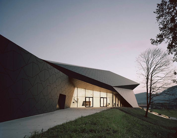
EQUITONE [natura] N251 on the Festival Hall of the Tiroler Festspiele. Image by Brigida Gonzalez. Architecture by Delugan & Meissl Architects.
In areas with a cold or snowy climate, dark colors may be a practical choice to help the building stand out among the landscape. This was the case with the Festival Hall of the Tiroler Festspiele in Tyrol, Austria. The area gets nearly 100 inches of snow per year.
However, there are some potential drawbacks to using dark colors in commercial buildings. One concern is that dark colors can make a space feel smaller and more claustrophobic. This can be especially true in smaller spaces, such as meeting rooms and offices. In hot climates, dark colors need to be used thoughtfully to avoid increasing the building's need for cooling.
Despite these potential drawbacks, the trend of using dark colors in commercial buildings shows no signs of slowing down. In fact, we can expect to see even more dark colors used in commercial buildings in the coming years, as companies look for new and innovative ways to create a distinctive brand identity and stand out in a crowded market.
In conclusion, the trend of using dark colors in commercial buildings is a reflection of the changing needs and preferences of businesses and consumers. The benefits - including their ability to create a dramatic effect, hide dirt and stains, and create a strong brand identity - make them a popular choice for many businesses. As the trend continues to evolve, we can expect to see even more creative uses of dark colors in commercial buildings in the years to come.
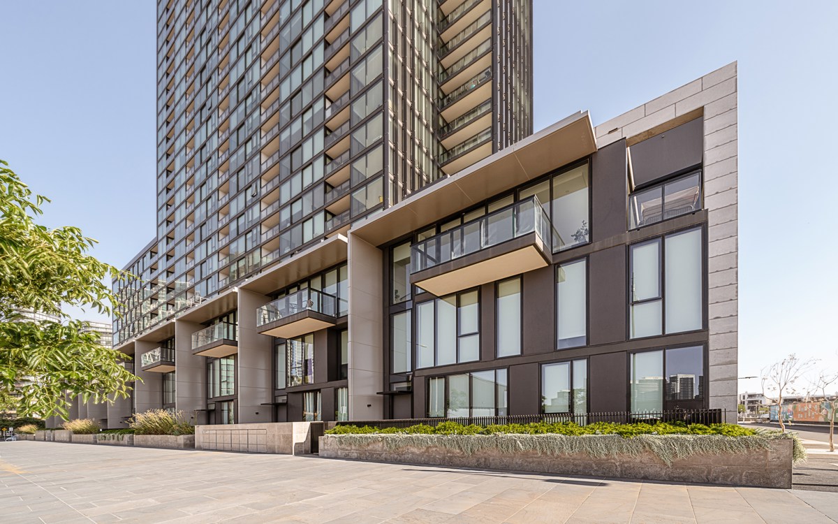
EQUITONE [natura] N074 on Collins Wharf. Image by Simone Salvagni. Architecture by Bates Smart.